Transparent, Authoritative Beauty Content & Commerce.
— MIRA Beauty AI
UX Case Study
Roles
Regina Rakhlin - CX Strategy / UX Director / Designer
Arundhati Sampath - Chief Product Officer
Benjamin Lord - Chief Marketing Officer
Brandon Garcia - Chief Operating Officer
Jay Hack - Chief Executive Officer
Client
MIRA Beauty AI
KPI
Increase blog engagement & conversion to commerce.
The Challenge
https://www.valtech.com/work/mac-cosmetics/?utm_medium=organic-social&utm_source=linkedin&utm_campaign=mena_client-growth&utm_term=company_alghanim&utm_content=mac-client-case_connected-experiences_image_case_week31-2022
https://www-voguebusiness-com.cdn.ampproject.org/c/s/www.voguebusiness.com/beauty/how-to-market-lipstick-in-a-pandemic
01 : Understand

Blog Redesign Requirements
Article Pages
Differentiate between the 3 article types (listicles, Q&A, and long-form).
Ability to link text & product images to the eCommerce portion of the site
Add author’s name to the page
Ability to see like articles
Ability to highlight text and post to social
General
Create an elevated design for the blog experience
Use the Blog navigation
Maintain the same elements currently on the page
Differentiate between the 4 blog sections
A design for both mobile & desktop
Main Page
Ability to display various authors
Default view of recent articles with the ability to see all
02 : Ideate
Research was conducted on various blog & publication sites to evaluate trends and common components for elevated sites. Direct competitors as well as indirect ones were considered during this exercise. Some questions to consider were:
Is the site e-commerce?
Whether the site is primarily for beauty?
Is the site a blog?
Does it appear elevated?
Are there multiple article templates?
• • •
While researching other sites, it became apparent part of what made the sites feel elevated was the typography and typographic elements.
In comparison to the current state of the MIRA typography, there was great opportunity for type, color, grid & spacing optimization, and consistency in the design system. Even though the site had a design system, it was apparent it needed to be revisited.
Typography
Improve overall type hierarchy by adding sizes and style ranges, while eliminating unnecessary, close type sizes.

03 : Prototype
Design options were put together for the Landing Page and the 3 article templates. Since I was not sure what the internal stakeholders were looking for “elevated”, the range of exploration would provide more guided information from the feedback.
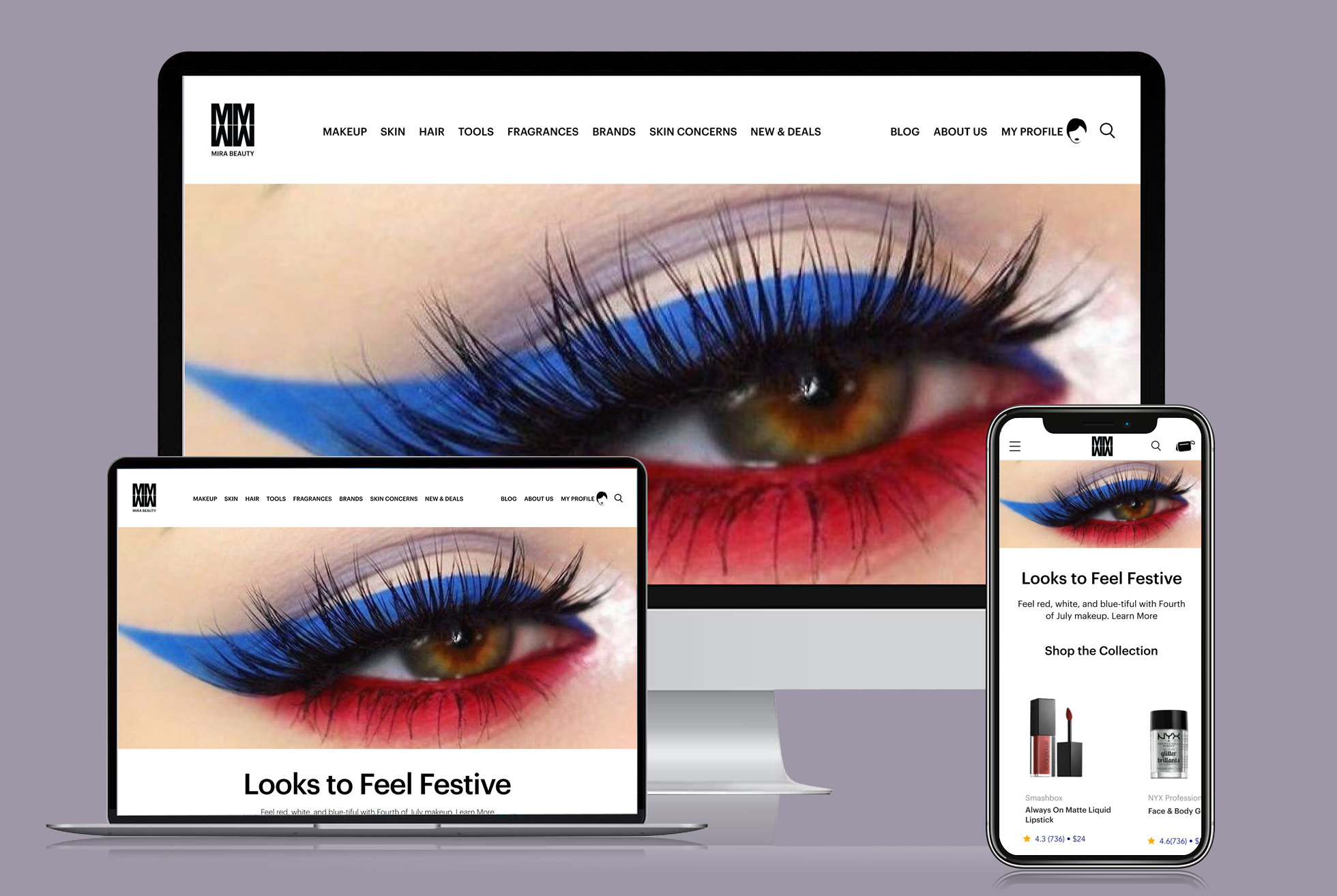
Landing Page
Option 01 : 2-Column Story Presentation
Option 02 : 4-Column Story Presentation
Option 03 : 4-Column Story Flex Grid
▲ Landing Page Design : Sprint 01
Providing design options that range from standard to more interesting. Giving the client variations that use the same elements, however, presented in a range they could select 1 complete option or elements from each. The variations were in the page header, navigation treatment, section headers, grid structure, and story density.
Article Template : Listicles
▼ Listicles Design : Sprint 01
This article type focuses on a product category or a beauty solution. While discussing this topic the intent is to display the featured products. For each of the products, the author describes benefits and how it relates to the topic. The customer can link to the product details page and purchase the item.
Sprint 01 : 1 Column with a Right Margin

Sprint 01 : 2-Column Grid with Alternating Image/Text
• • •
Article Template : Q&A
▼ Q&A Design : Sprint 01
For this template, the author would capture and interview. By having a Q&A session and sharing the interviewee’s beauty insights as well as product recommendations. Enabling the reader to view and purchase products inline with the article.
Sprint 01 : 1 Column with a Right Margin
Sprint 01 : 1 Column with a Right Margin
• • •
Article Template : Long Form
▼ Long Form Design : Sprint 01
For this template, the author would capture and interview. By having a Q&A session and sharing the interviewee’s beauty insights as well as product recommendations. Enabling the reader to view and purchase products inline with the article.

Sprint 01 : 1 Column with a Right Margin
Sprint 01 : 1 Column with a Right Margin
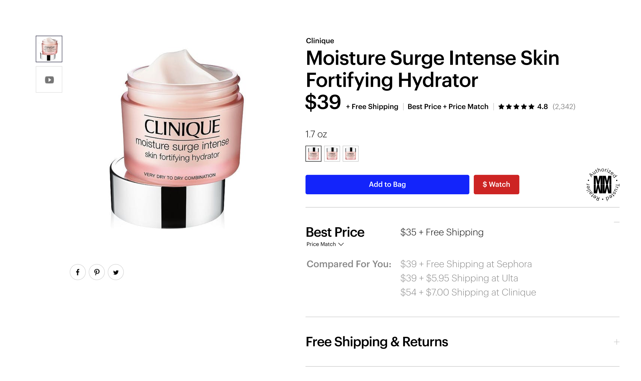
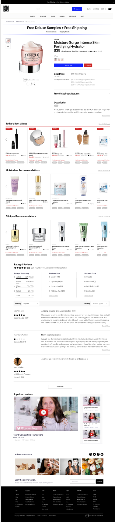
Product Page [Top]
Original Design ▶
The effort and objective was focused on customer insights based on user interviews from the prior week. Additionally keeping in mind the limited developer resources.
• • •
▼ Design Sprint 01
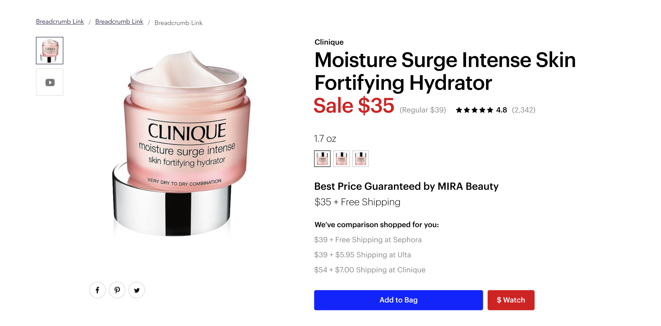
During this sprint the goal was to enable customers to see the price comparison with the ability to select their preference. Since the page is long, providing the ability to see an overview of the contents and ability to navigate to the desired section of the page.


Sprint 01 : Option 01
Sprint 01 : Option 02
Sprint 01 : Option 03

Sprint 01 : Option 03
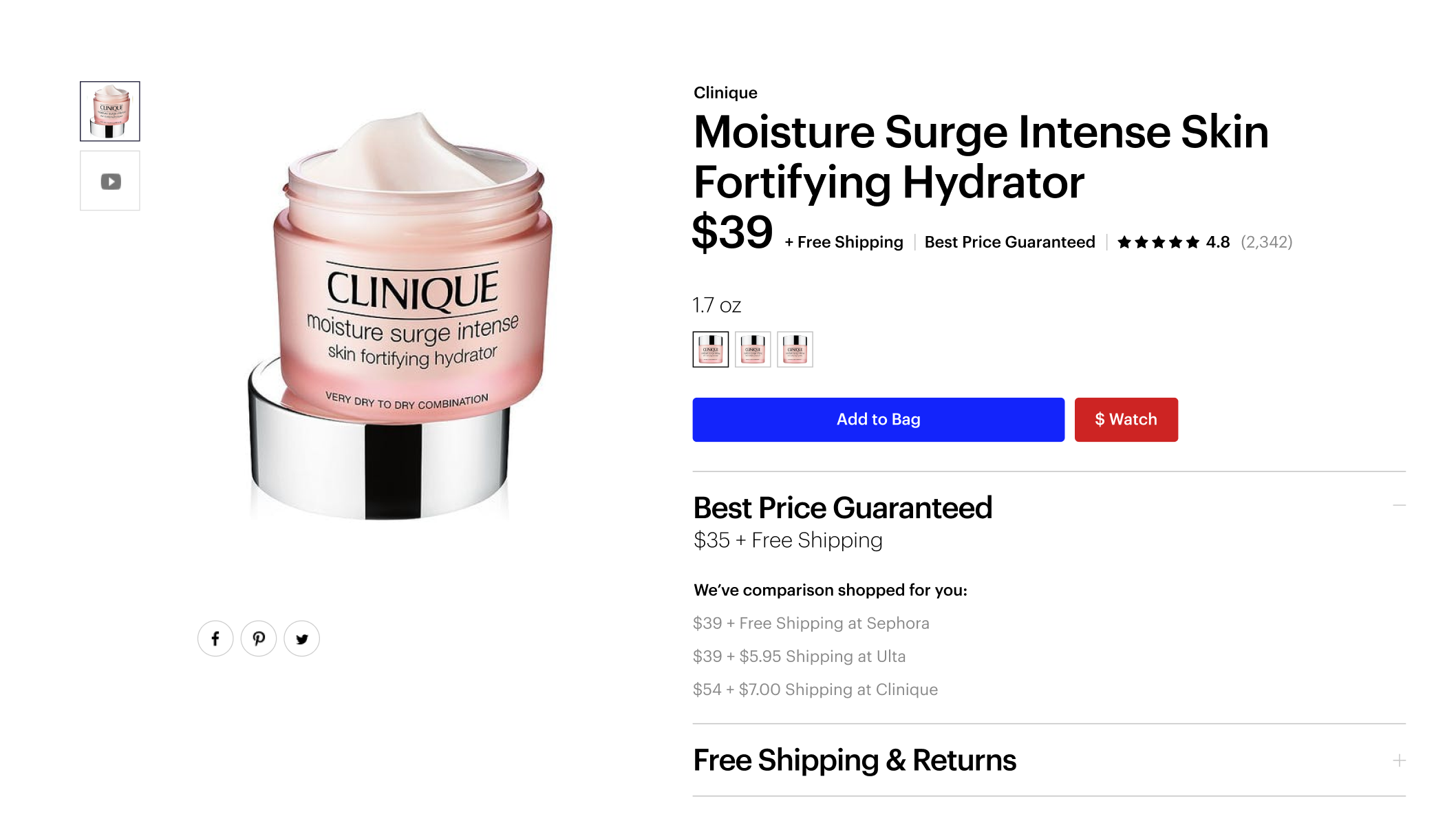
▼ Design Sprint 02
The designs above were shared with participants during a user interview session. While business felt it wanted to offer customers to select any of the price comparison options, the customers felt just seeing them was enough. The business requested design options for a more prominent price.

Sprint 02 : Option 01

Sprint 02 : Option 02
▼ Design Sprint 03
For this next sprint, the exploration focused on sale pricing, price tracking, free shipping & returns, price guarantee and matching and product authenticity.
Sprint 03 : Option 01
Sprint 03 : Option 02

Sprint 03 : Option 03
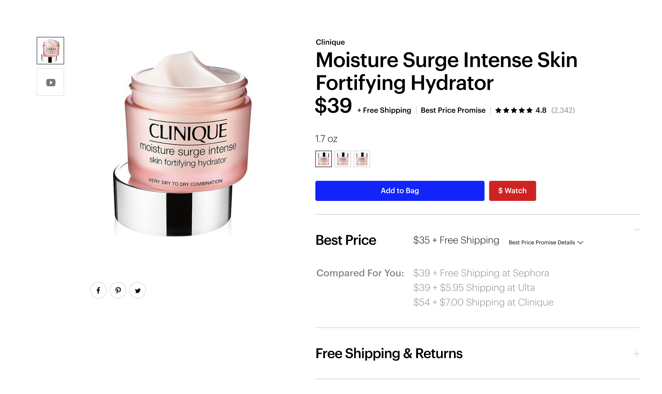
Sprint 03 : Option 04
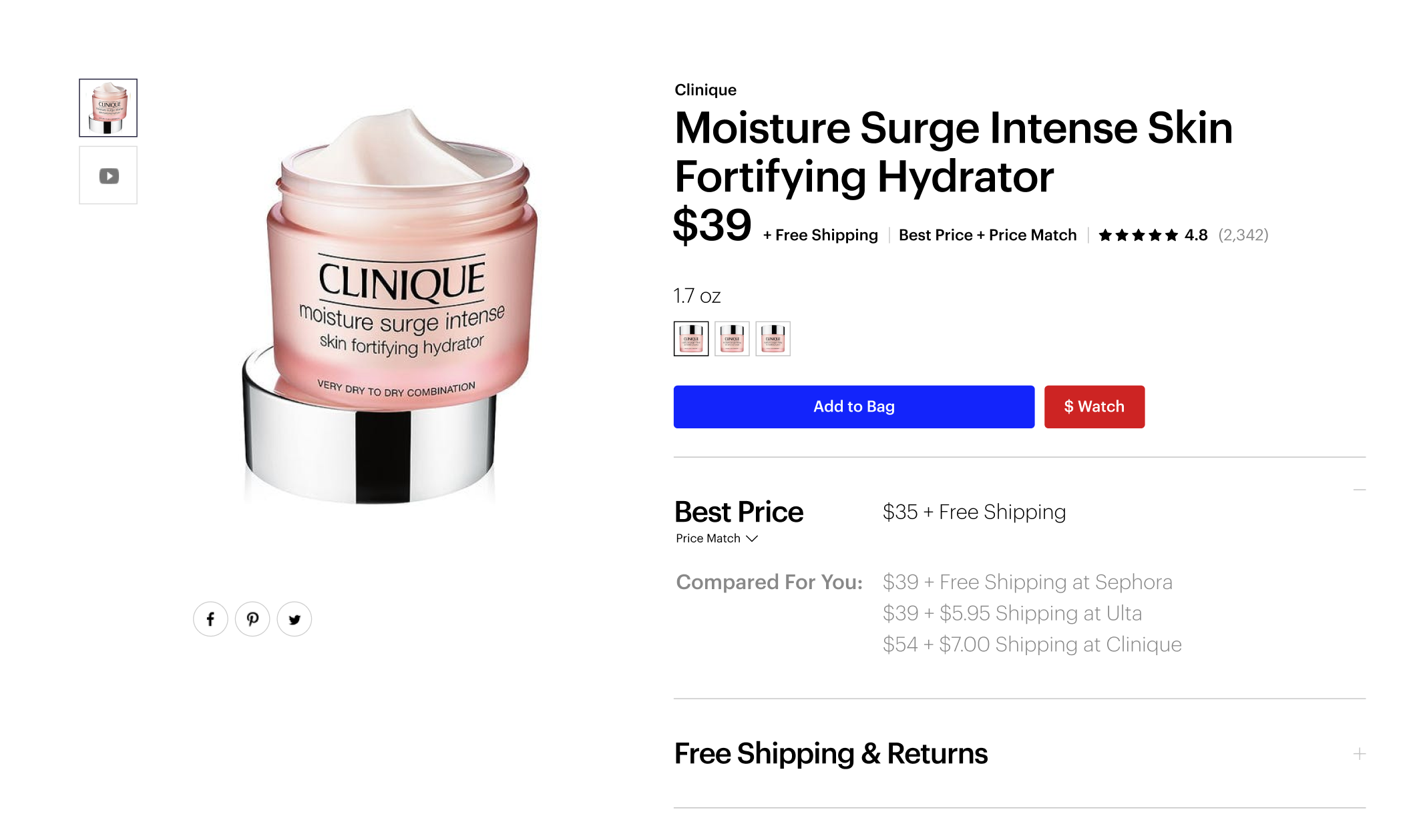
Sprint 03 : Option 05

Sprint 03 : Option 06

Sprint 03 : Option 07
Sprint 03 : Option 08
• • •
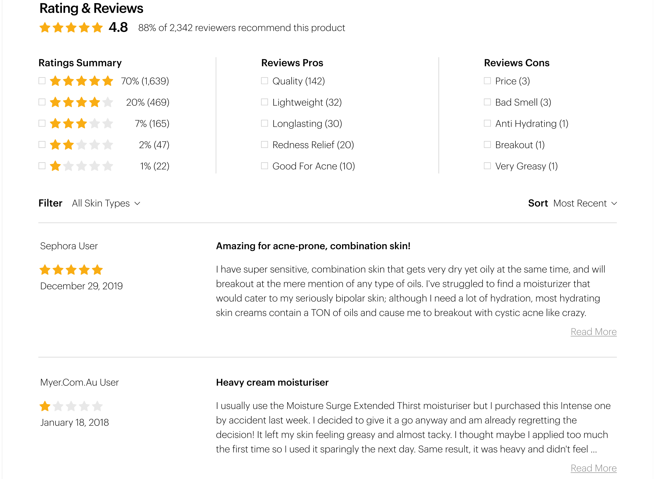
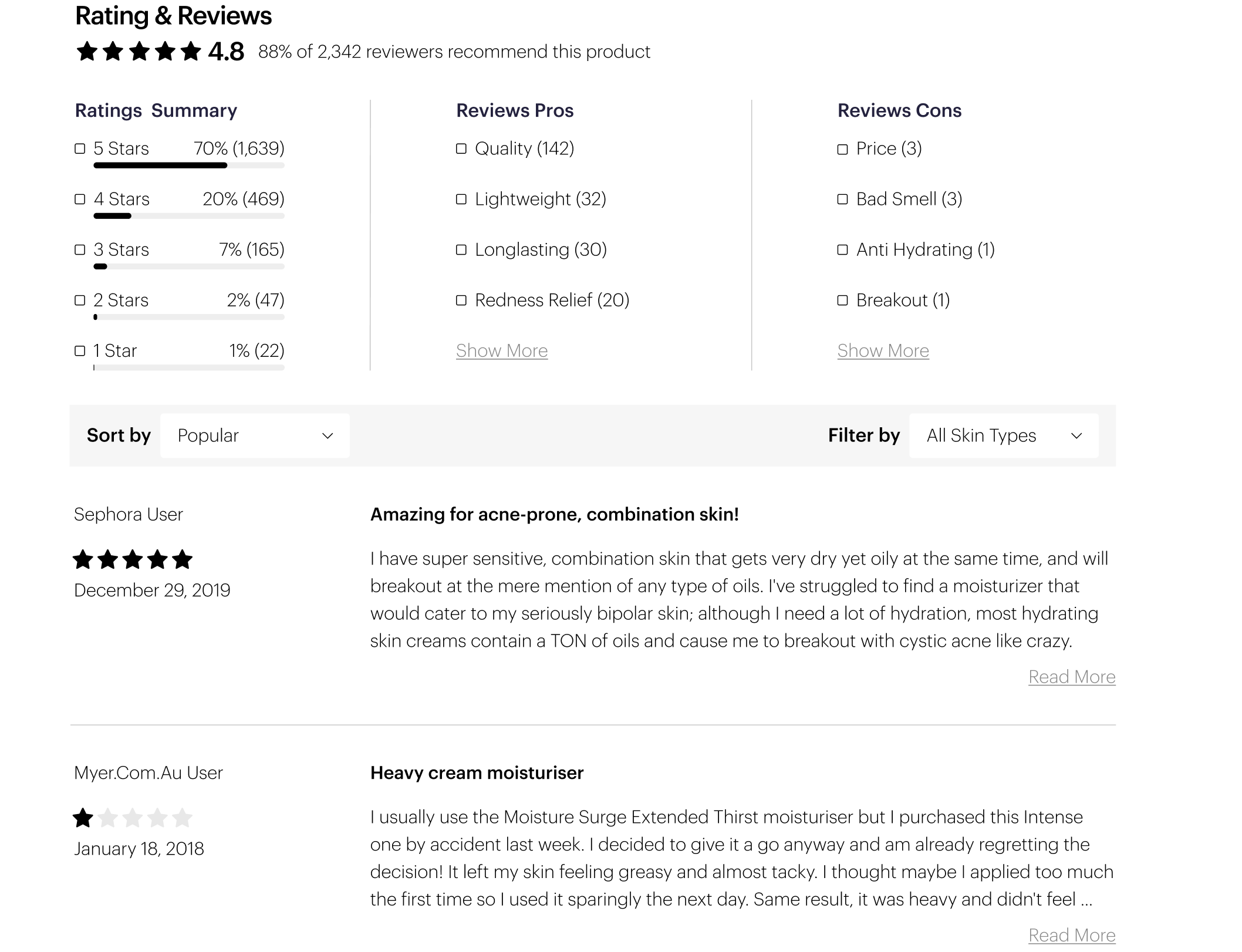
Product Page [ Bottom]
Original Design ▶
Taking this product page feature and making it a more useful experience for the customer. Also, updating the design to be more elevated matching the brand projection of the rest of the site.
• • •
▼ Design Sprint 01
Streamlining complex content, simplifying redundant communication, explore optimal presentation of the elements, improve user usability and overall user experience.

Sprint 01 : Option 01

Sprint 01 : Option 02

Sprint 01 : Option 03
Sprint 01 : Option 04
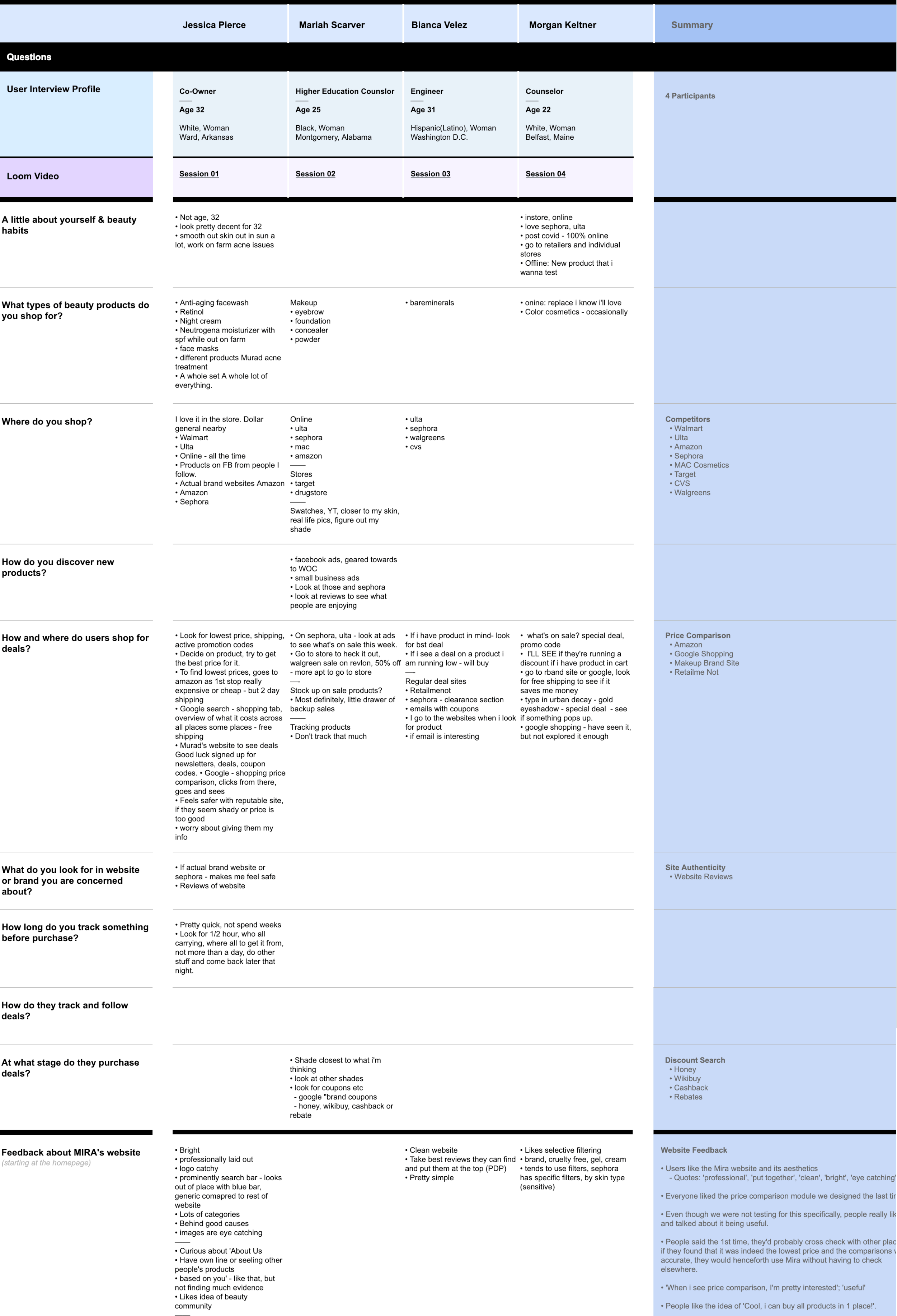
04 : Usability Testing
User interviews were scheduled every 2 weeks. During these sessions designs currently in progress were shared with participants. As well as live enhancements deployed to the production environment.
• • •
An example of documentation from such sessions can be found below:
05 : Results
Taking all the above into account and several rounds of iteration, the final designs for the redesigned homepage, search results page and product page template are below:


Final Experience Designs


—— All Project Samples ——