CRO Redesign Through an AI-Native Workflow
— Livable Hair
UX Case Study
Roles
Regina Rakhlin - AI Experience Designer & CX Strategist
Stefanie Nuxoll - Stakeholder & Founder
Client
Livable Hair
KPI
AI-native design that drives conversion.
From discovery to production-ready assets, entirely within AI-native workflows, a full end-to-end redesign for Livable Hair. Serving as sole AI design lead, handled competitive analysis, UX strategy, wireframing, copywriting, & AI image direction.
The Challenge
Prompt Architecture is Design Work
Generating quality AI output requires the same structured thinking as any brief. Audience, tone, constraints, and intent were defined before prompting, not discovered from the output.
Speed Without Shortcuts
AI-native workflows compressed timelines versus traditional agency processes, without skipping strategy, rationale, or quality review. Faster execution enabled more iterations, not fewer.
AI Principles & Workflow
Each phase of this project ran through a deliberate AI-native workflow. Research, writing, imagery, and design were handled by purpose-matched tools, with human judgment applied at every decision point.
AI as Co-Pilot, Not Autopilot
Every AI output was reviewed, directed, and refined. Tools accelerate execution but don't replace judgment. Accountability for every decision remains.
Iteration Over Generation
Initial outputs were starting points, not final assets. Each phase involved multiple refinement cycles, tightening copy, redirecting imagery, and adjusting layouts until output met brand standards.
Right Tool for Each Phase
Perplexity handled research, Claude copywriting, Midjourney and ChatGPT Image Gen photography, Figma and Adobe layout and production. No single tool did everything.
Brand Consistency Across Tools
A unified brief, palette, and voice guide was applied across every tool. Outputs from different AI systems were reconciled into one cohesive design system, not treated as isolated deliverables.
Livable Hair needed a site that could do three things at once: convert professional artists as the primary revenue driver, elevate a premium brand that had been underselling itself, and build consumer trust in a US market with no prior awareness of nano hair extensions. The existing presence couldn't carry any of them.
The redesign had to serve three distinct buyer journeys simultaneously. First, professional artists and nano technicians needed a frictionless path to purchase premium hair at a professional discount, as this was the highest-value repeat purchase segment and the core of the business. Second, aspiring stylists and career changers needed a clear, compelling route to training enrollment and certification. Third, end consumers needed education on why nano extensions are different, and a direct connection to certified professionals in their area. One site. Three conversion objectives. Zero compromise on brand elevation.
01 : Research
Deep stakeholder intake sessions surfaced the business objectives, conversion priorities, and brand gaps that shaped every decision that followed. Every insight was documented and pressure-tested before a single design decision was made.

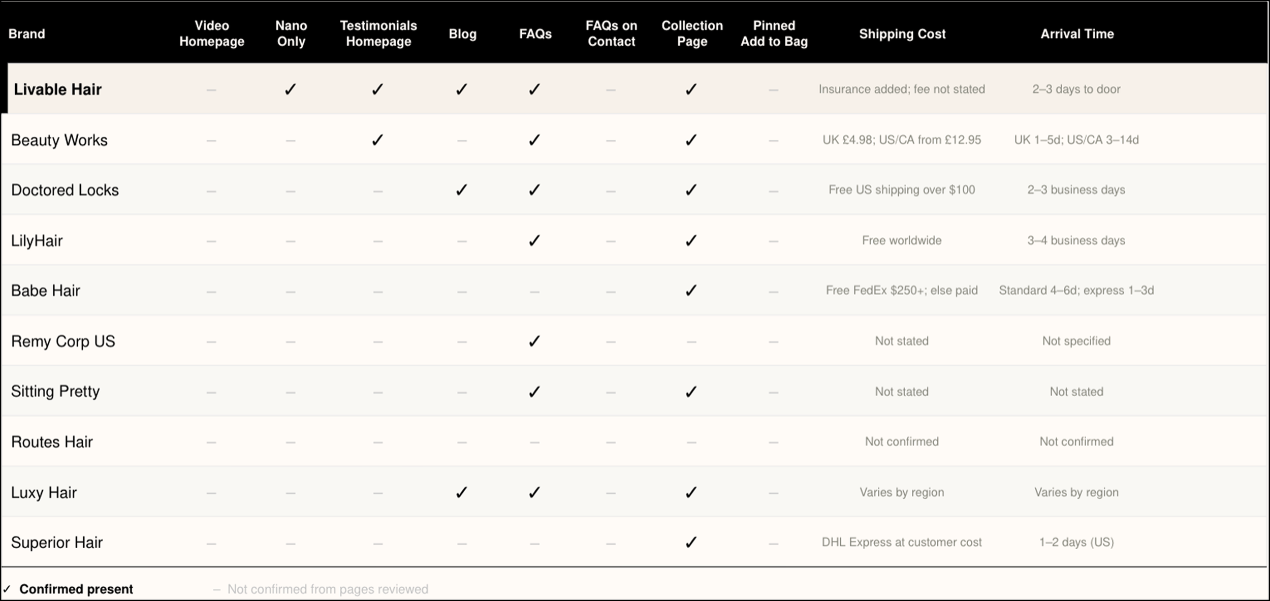
The only nano-exclusive brand in the competitive set. Every gap identified is an opportunity the redesign addresses directly.


Competitive Analysis

Design & AI Workflow
Strategy, Design, & Content Moving As One AI compresses the distance between brief and execution, so the focus stays on decisions that matter. • Every Word, Every Layout, Every Product Description shaped by brand intelligence rather than templated output. The result is a site that thinks like Livable, speaks like Livable, and performs like a brand built for scale.
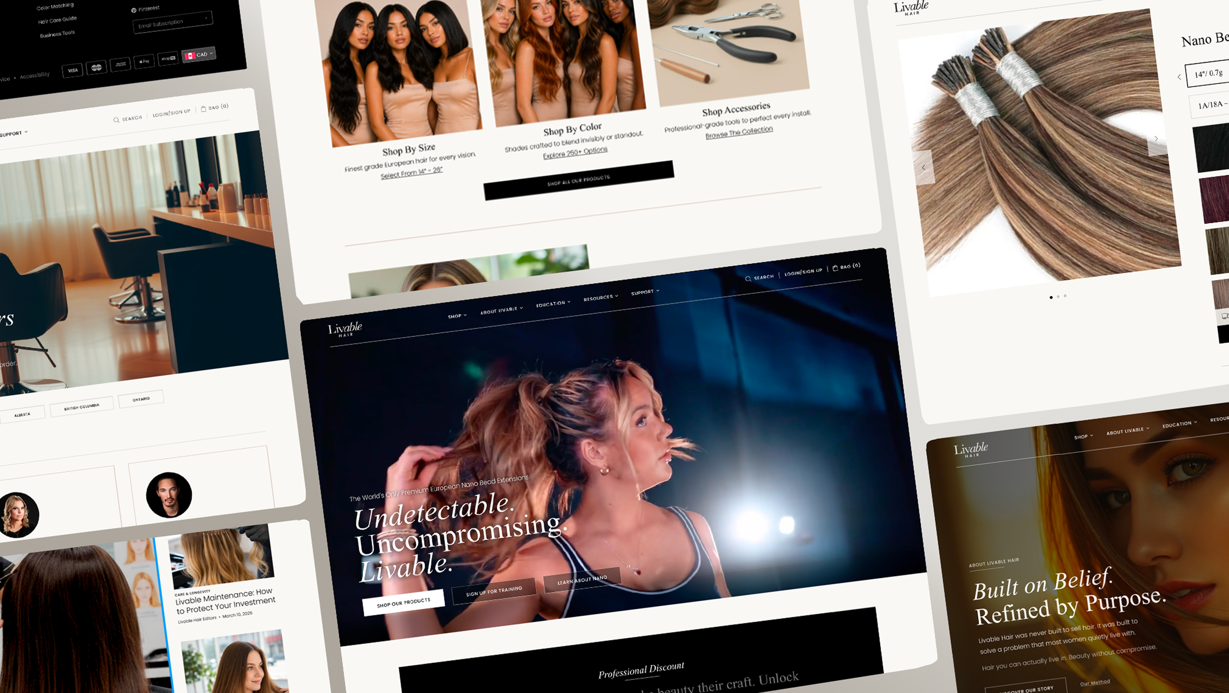
Homepage Redesign
• • •
• • •
Design & AI Workflow
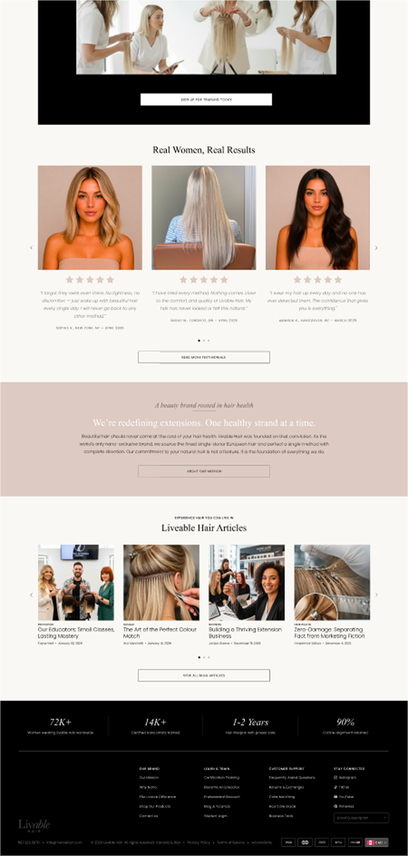
Real Women Real Results Carousel leads with faces before claims, an AI-informed sequence placing social proof at peak trust-building position. • Star Ratings and Named Attribution surface the credibility signals CRO research ranks highest for considered purchases. • Brand Mission Section converts a values statement into a retention moment, AI-drafted to speak directly to the emotional driver behind every purchase decision. • Articles Grid extends time-on-site through education, content structured around the search terms real buyers bring to the category. • Stats Footer Strip closes the scroll with authority, 72K+ women, 14K+ certified students, 1-2 year lifespan, 90% repeat rate, each figure positioned to answer the final objection before checkout.
Design & AI Workflow
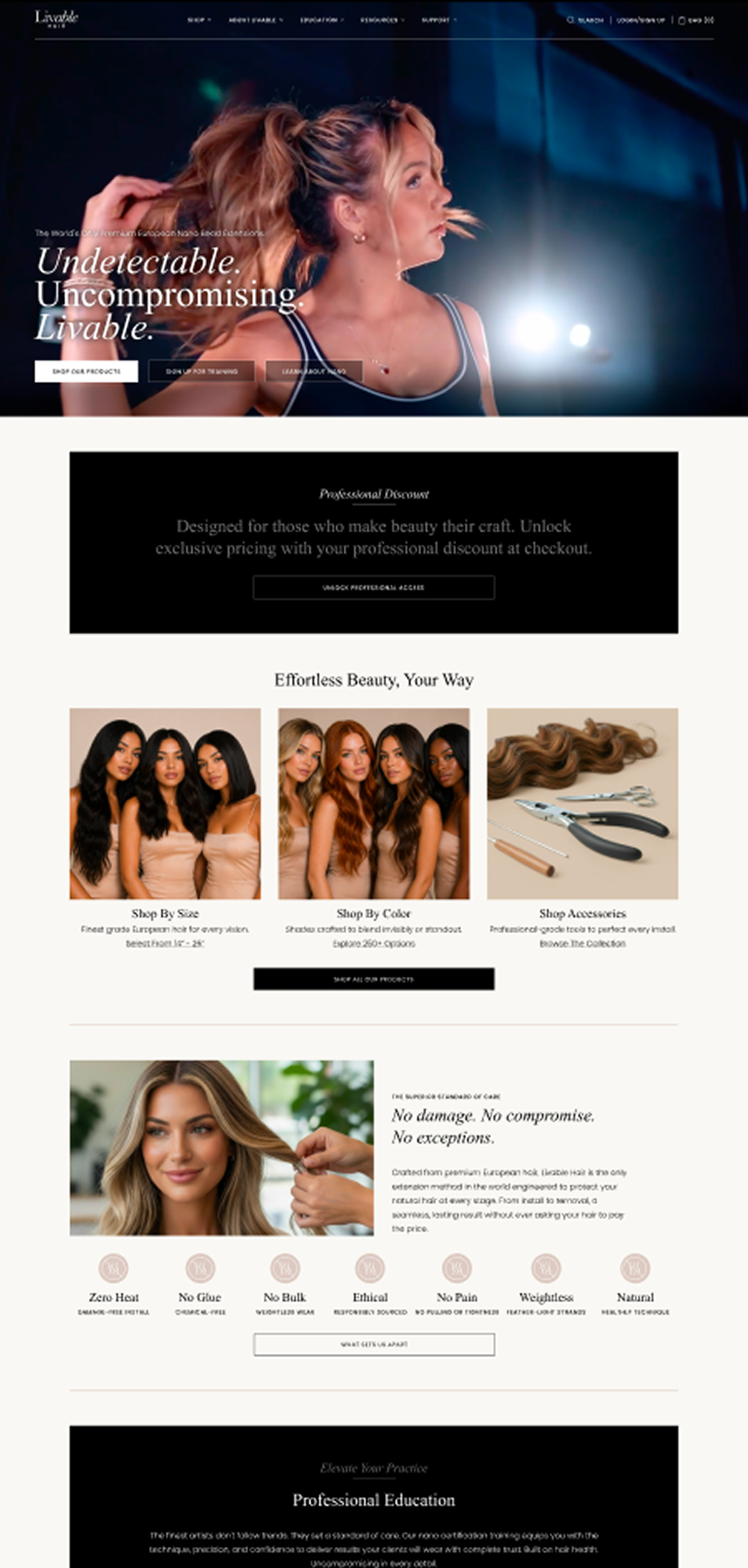
Three-Word Hero Undetectable. Uncompromising. Livable. pressure-tested across multiple AI copy directions before a single line of design was laid down. • Professional Discount Surface positioned at first scroll, not buried, a CRO decision informed by AI audience segmentation and B2B revenue priority. • Shop by Size, Color, Accessories mirrors real purchase behavior, with category structure validated through AI-analyzed browsing patterns. • Values Iconography Strip compresses the brand's health-first philosophy into six scannable proof points, refined through AI content iteration. • Professional Education module closes with purpose, its placement informed by scroll-depth analysis and conversion funnel modeling.
Sprint 01 : Option 01

Sprint 01 : Option 02

Sprint 01 : Option 03
Sprint 01 : Option 04
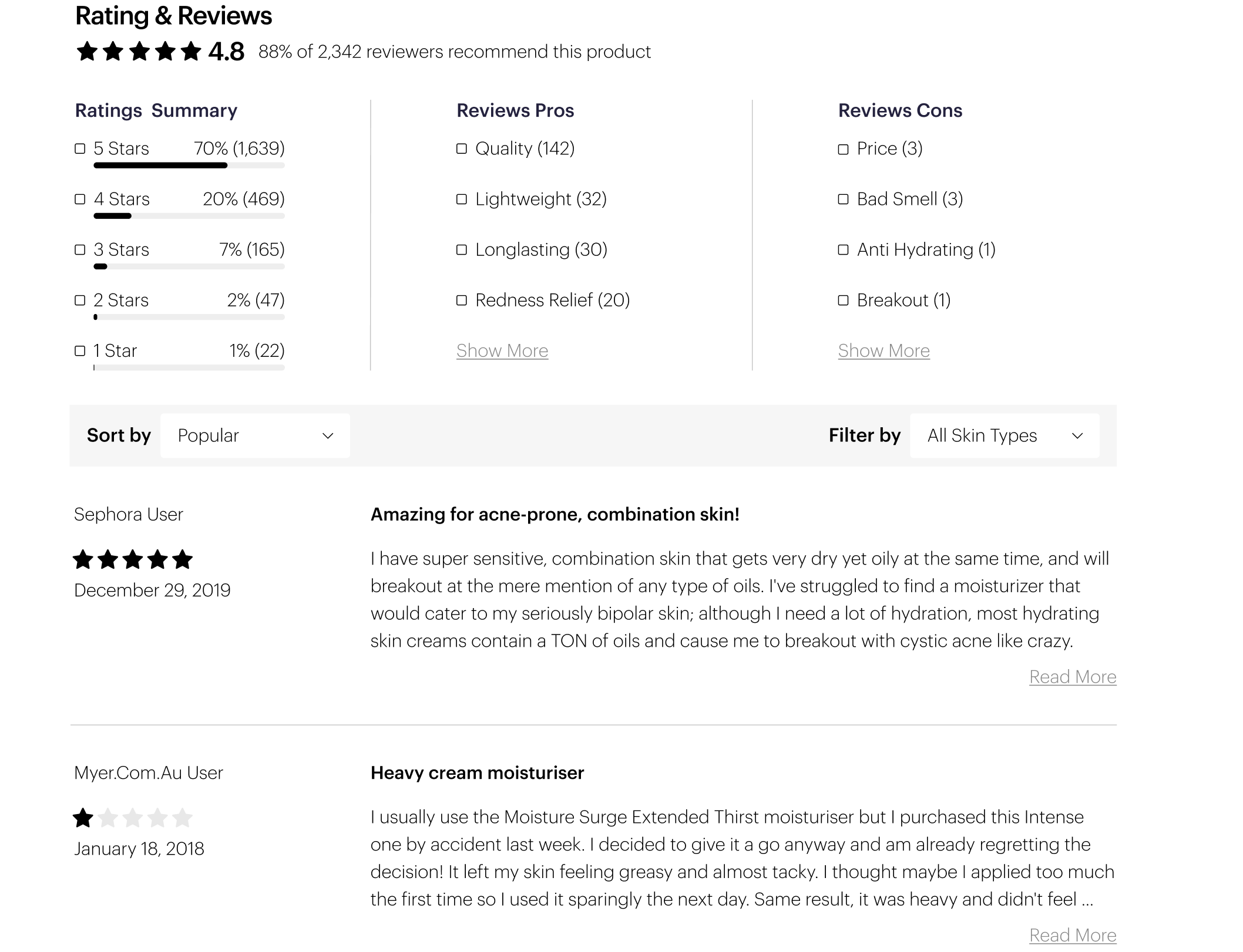
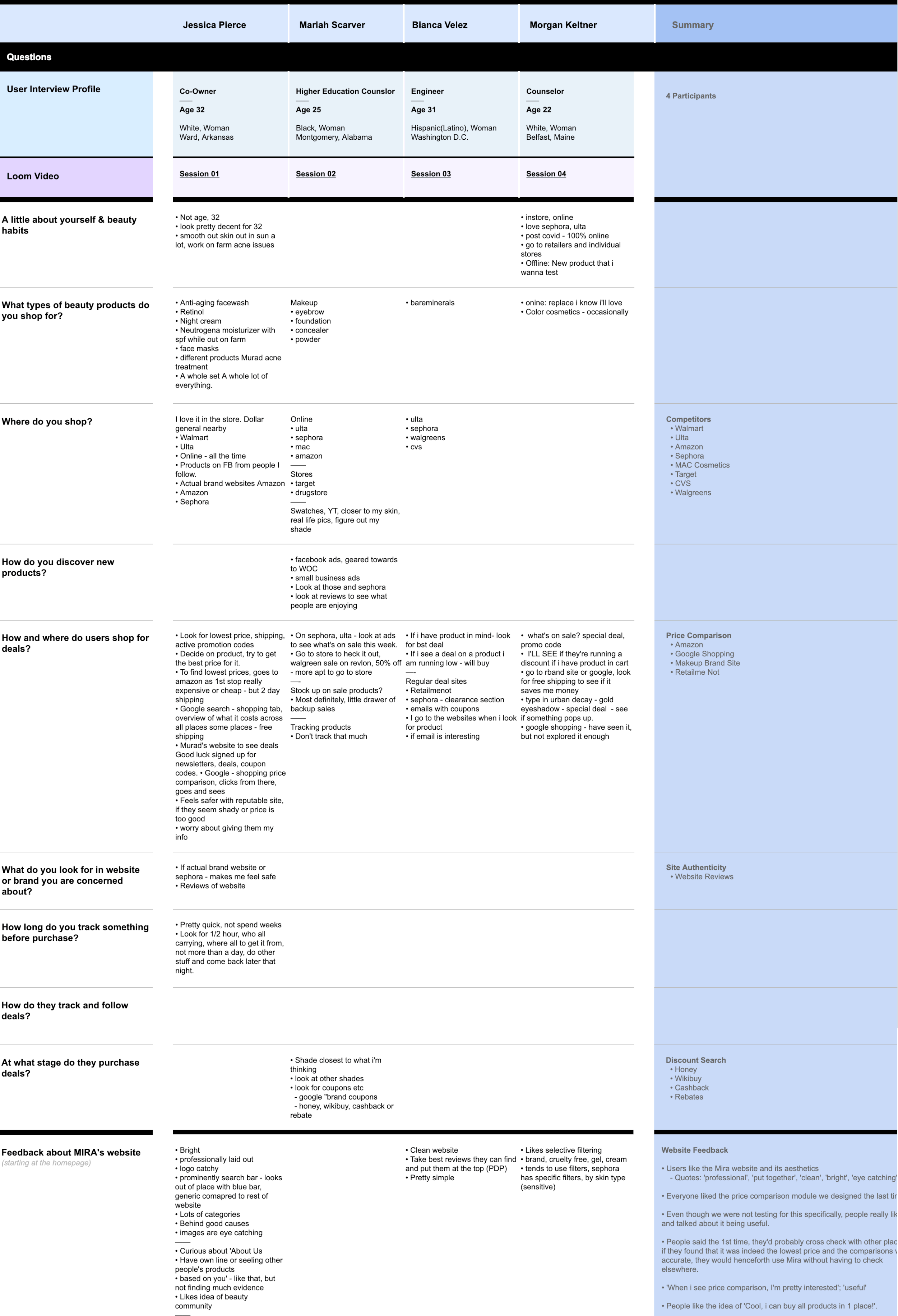
04 : Usability Testing
User interviews were scheduled every 2 weeks. During these sessions designs currently in progress were shared with participants. As well as live enhancements deployed to the production environment.
• • •
An example of documentation from such sessions can be found below:
05 : Results
Taking all the above into account and several rounds of iteration, the final designs for the redesigned homepage, search results page and product page template are below: